Website · AV & home automation
Audire
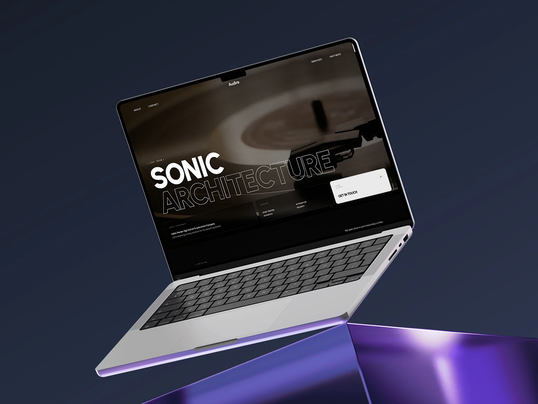
Audire sells calm, expensive, invisible technology. The old site sold none of that. We rebuilt it around motion and restraint, so the site feels like the product.
- Client
- Audire
- Industry
- AV & home automation
- Role
- Design & build, end to end
- Scope
- Full redesign
- Location
- India
- SvelteKit
- GSAP
- Tailwind CSS
- Vercel
The problem
Audire occupies the top end of a market where most competitors present themselves with stock photography and spec sheets. The brand’s actual product, discreet and beautifully engineered, was being described rather than demonstrated. The site had to convince an architect or a homeowner spending lakhs that this studio understood restraint.
What we did
- 01
Design for the room, not the spec sheet
We led with atmosphere over feature lists. Large imagery, generous negative space, and typography with enough confidence to sit still. Specifications stayed. They moved below the point where the visitor had already been persuaded.
- 02
Motion as the demonstration
GSAP-driven scroll choreography carries the visitor through each system rather than dropping them into a grid. The animation is the argument: this is what considered engineering feels like.
- 03
Built to stay fast under all that motion
Every animated sequence is compositor-friendly and torn down when off-screen, so the experience holds up on a mid-range phone as well as a studio display.
What shipped
- Full visual identity applied across the site
- Scroll-choreographed product and systems pages
- Responsive layouts from 360px to ultrawide
- Enquiry routing for high-intent leads
Next project
Metromale Clinic
Mobile app · Healthcare